

So this is the new and improved diagram that makes much more sense. The idea is that once the message goes through the channel it then can articulate noise before it gets to the receiver.
these are some color iterations for my diagram. I tried some bright hues as well as some more antiquated ones. I truly believe that more antiquated color palette is working better, but I could be bias in saying that.
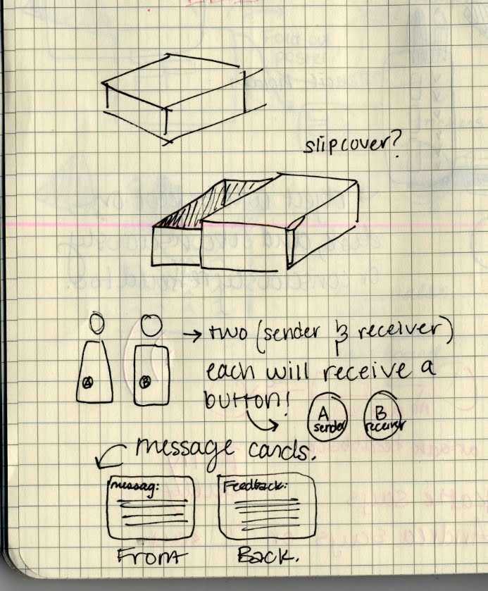
 So I am going with the theme of a Communication Kit. The reasoning behind this idea is linked through my own experience with packaging. I have kept many packages that products come in, and my goal is to put my Communication content inside of a box to give it more importance. For some reason we want to keep things that come in pretty boxes or a container that isn't made out of plastic. It makes the product seem more special to the user and valuable. I don't want my audience to receive a pamphlet that is easily discard-able. I would rather them want to hold on to a quality artifact, even if it is only pretty. They will still subconsciously be studying communication if they hold on to the Communication Kits and its contents.
 The content that will be inside of the Communication Kit will consist of
I pamphlet
II poster
III Buttons that will correspond with message cards
These are some iterations for the cover of my pamphlet. I like the idea of saying "hello" to my viewer as well as the use my noise mark icons. The idea of having a cover that contains no words could work since the viewer will be attacked by words on the inside.

No comments:
Post a Comment