
 These were my sketches that lead to the digital sketches above. I blended the first option and the second option. We thought that the third option was to confined and that it was lacking practicality.

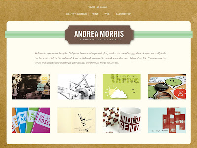
 This is the start of my site map. It is really difficult pulling all of your work up and organizing it! I decided to go with these categories, Identity Systems, Print, Web, and Illustration.

No comments:
Post a Comment