Showing posts with label NA. Show all posts

Wednesday, December 9, 2009

Final Data Presentation

Data Presentation from Andrea 'Mo' Morris on Vimeo.


Granted, this final video was not the initial idea but sort of a serendipitous realization when I was shooting some photographs. After the long trials and tribulations of getting live footage to work, I decided to go to photography. The course that I photographed did not allow a video camera either. The idea of the ball going backwards, away from the hole, sets in motion the idea of the salaries getting smaller and enhances the fact that this campaign reveals how society is negatively affected by these statistics. The music accents exactly on the frame where the viewer is able to read "ER Doctors made an average of 215 thousand a year". I took to heart a lot of the awesome critique that I got from my fellow peers and I am very happy with what this video has become.

After creating this data presentation I realized that it might be successful for this to become its own campaign. One data presentation might highlight on basketball players salaries, while another might use the salaries of tennis players. It would create awareness of where our money is going, compared to where it should be going.

Thursday, December 3, 2009

Statement for Show Opener


explain hierarchy of and relationships between the communication channels. what takes priority, if anything, and when does it do so?

right now my animation is not complete due to technical difficulties, but I will judge it as it is now. The image captures are of footage that I shot, that I cannot edit. I communicate to the viewer with digital text that fades in and out. It is very clean and to the point, but it is modest. The facts are suppose to humble someone and make them realize where there money should be going.

why you used the media/production techniques you utilized. what did that rendering style or formal approach add to your story?

I want to re-shoot for Wednesday so that I can get some live footage. I will shoot the same shots that are represented in my animatic and maybe some more experimental shots. Currently the rendering style is screen shots of live action footage, which have an interesting television interface quality to them. I wanted to use live action footage, because I am not used to editing or using it. I wanted to gain experience and knowledge, which I now have...and I will NEVER use a sony handycam ever again.

what, if any, new things did you learn through this process? was it more difficult to orchestrate things with all your options open?

I learned how to rip footage from a dvd, how to get into one of the schools computers and put new software on it without an administrators password (I took it off later of course), how to successfully use a fire wire, how to stream video from a television onto a camera, how to work new programs such as handbrake, VLC, and Mac the Ripper, how to create an animatic, how to ask Michael May for help, anyways...none of these methods worked for making footage editable but I will have this in my internal library for future reference.

My five facts:
Tiger Woods made $128,000,000 in 2008
Phil Mickelson made $62,000,000 in 2008
Jim Furyk made $15,000,000 in 2008
ER Doctors make on average $215,000 a year
Teachers make on average $49,000 a year.

Sources:
Sports Illustrated
Bureau of Labor Statistics

Monday, November 23, 2009

Initial storyboard: data presentation

the idea is show positive aspects of the golf course via live action. The facts will reside somewhere in the shot digitally. The negative facts will accompany the negative aspects (like the golf ball being in the bunker).

Thursday, November 12, 2009

Opener/Date: getting started

I have decided to go with the data presentation, because I can really take advantage of the fact that I have a diamond in my animation. The idea of hitting the diamond stems towards the lavish and rich lifestyle golfers can lead. The diamond itself can represent money, and the fact that professional golfers are paid more than doctors is ridiculous! The same story goes for most professional athletic sports. I would like to use this idea to make a statement on the fact that it is so ridiculous that golfers are paid too much, and that important people like teachers are not paid enough. This will of course parallel how ridiculous it is that I have my golfer hitting a diamond instead of a golf ball. I feel like this project will work better in my portfolio, because it will reveal my use of rhetorical devices in the animation. The fact that substituted the ball for a diamond reveals a visual pun. The decision to make a data narrative will help reveal this idea even more with some statistics that will reveal how much a professional golfer makes in comparison to a teacher or a doctor.

This piece of graphic design exists to increase awareness of where our money is going, which is an absurd destination. We as a society are based around entertainment, and maybe we as designers can reveal the truth in order to evoke some change. This animation could be a commercial, a part of a website or part of a campaign, and it would be able to stand on its own without a presenter. The audience would consist of the everyday joe, a.k.a. the ones that have no idea where their money is going. So...probably the 26 yr. old football fanatic who still drinks beer all week and lives off of mommy and daddies money...perhaps? Or the wealthy golfer himself...

Research...
http://www.youtube.com/watch?v=L-tRHNElTo4
http://www.youtube.com/watch?v=bRHjmog9n7k"
http://www.youtube.com/watch?v=UTuk5Uloyjg"
http://www.agencycollective.com/projects/MKT-DEMO"
http://www.agencycollective.com/projects/Pulse-Smartpen"
http://www.agencycollective.com/projects/Impossibilities" (this one really appeals to what I want to do!!!)
http://www.d-kitchen.com/projects/budweiser#
http://www.d-kitchen.com/projects/shark-week# (this one blows my mind!)
http://www.d-kitchen.com/projects/film-festival#
http://www.d-kitchen.com/projects/true-blood-main-title#

This is an interesting article that turns the table when it comes to the dispute between athlete salaries and teacher salaries.

Tuesday, November 10, 2009

Statement on Nonlinear Project


what do music, voice, and sfx bring to a narrative that is different from visual communication channels?

The elements of music, voice and sound all enhance the sensory experience for the user and hopefully increase the understanding of the narrative and the meaning. The visual aesthetic can be aided by the sound effects as well. For example, in my nonlinear narrative I have the music element of Billie Holiday's Swing Brother Swing, which enhances the temporal aspect by pushing the narrative back in time. It also can change/enhance the meaning of my animation since the main chorus is "swing it brother swing", of course alluding to the fact that you can "swing" a golf club like your body while dancing. Billie Holiday herself can also pertain to the idea of a diamond in the rough if the viewer would like. She was a celebrity that lived a lavish lifestyle and was always in the spot light.

compare and contrast different communicative qualities of music, voice, and sfx

While music can affect the whole ambiance, a sound effect may increase a specific character/persona of a specific portion of the narrative (like a button). The sound effects seem to make the narrative more personal (the buttons become personified) and can create a comfortable environment for the user. For example, the slight ping sounds in my narrative come off as "cute", it is almost as if the diamonds are enjoying being clicked just like a dog would enjoy being played with. The idea of voice within a narrative can act as instruction, and can seem offensive since the viewer cannot actually talk back. However, the user does have the power to make the voice shut up, which is nice if they don't like what they are hearing.

the differences between simultaneous and sequential communication

The idea of simultaneity is when two or more objects are side by side and are affecting one another, which makes me think juxtaposition. Sequential refers to more of a linear storyline with one event after another. In my nonlinear narrative the only sequential element is the actual animation itself that can then simultaneously be play while a song is playing or sfx. The user has the ability to control the simultaneity in any sequence (order) that they would like. For example, the video can be played first, then music or the music and then the video. While those two elements are simultaneously active the user can receive multiple meanings.
user vs. designer control

This project opened my eyes to this concept and in our reality as designers we should realize that design can't just consist of one pure message, and that it can be altered by our audience. The audience will become more creatively engaged with our work when we allow them to have a lot or even a little control. They all of a sudden feel more important if they can click a shape and it then plays a video. However, we as designers have almost always something that we want to say and too much user control can create noise and alter the message we are trying to communicate.

participants ability to discover relationships as they play

The user likes to figure things out, and we as a culture like to engage in problems in order to solve them. There is a level of satisfaction when there is a moment of discovery. There seems to be a level of enlightenment in the attitude of the user user when they decide that "oh! this song is saying swing brother swing, and that must be about the golfer swinging the club in the video." It isn't necessarily and extremely difficult mathematical equation , but it is a conclusion that is nonetheless enjoyable.

Wednesday, November 4, 2009

I am finally getting somewhere!

after the long night last night, I woke up this morning refreshed and ready to dish out some new ideas. This is what I came up with...

This is the initial screen that would pop up...
The tickets would separate and turn a color when rolled over.
The icee would move up and turn blue when rolled over.
The popcorn would rise up and turn red. It also exposes the hidden piece of popcorn that was behind the icee!
The reel turns yellow and its angle will shift. I am thinking that I want the reels to maybe turn? If I can figure out how to do that... but by clicking the projector the user would initiate the movie.

The photographic background relates to the actual animation in its photographic rendering style. The icons are more or less like coloring book images so that the user can assume that they are buttons since they are "cartoony" and don't fit it. I haven't been able to put in the video or the songs yet those are still a task in and of themselves, but I am SOOOO happy that I finally found a composition that I am content with.

Monday, November 2, 2009

3 Visual Directions

I seem to be having a lot of trouble rendering out how I want my interface to be for my interactive design... its a little frustrating.... :( but here are some experiments so far.

These are some of my sketches for the cinema idea where the diamonds will represent my "buttons" as well as decorative elements within the theater. The rendering of the theater is hopefully illustration, but I am not too happy with what I came up with, maybe it means I will have to vector my drawings or just go with photo collage?
This was another way of "projecting" my silent film. I don't have any of the diamonds included into this one, but I was thinking that I could create some fun shapes that were on the actual projector. Even though this composition is simple it might be the best route for needs of understanding the overall objectives of this assignment. I was thinking that the parts of the projector could change into color when the user rolled over them, and clicking them would start a sound and/or start the movie...maybe even twist a reel!
This would be the initial framework for my interactive design.

This would be what would happen when the buttons were activated they would play a sound and either movie ex. the popcorn or the projector when rolled over would light up the screen.

Friday, October 23, 2009

Non-Linear Framework: Sound

These are my initial sketches for my flashwork in my animation. All of them start with a run through of my original animation to fully engage the veiwer/user and to give them an idea of how my interactive aspects will work.


Wednesday, October 14, 2009

The Copyright Issue

I had an interesting learning experience today, one in which I felt really hit home for me.
As graphic design students we are open to use any imagery/material we would like to in our design work. Our options are literally endless and we have NO boundaries as to what we can plop into an illustrator document, print out, and call our own. We think we can call something "ours" when we really just screen-grabbed an image from a google search and placed it in a template where we maybe changed the color, and it is magically transformed into artwork that WE created! Sounds a lot like stealing or cheating to me. I find this to be a fault in the graphic design learning curriculum.
I posted a stop motion animation to facebook the other day thinking that it was no big deal, and I just wanted some of my friends to aquire a taste of what I was doing here at the "tute". After telling a few people to check out the video I was told that they couldn't find it on my facebook page. I thought that this was weird since it was working just fine the night before.
I curiously loaded my page and was so abruptly smacked in the face with a message stating "your video was removed because it appears to contain copyrighted material owned by a third party...please note if you re-upload this video without filing a counter-notice, or if you upload another video that infringes on the rights of a third party, we may remove that content. This could cause your ability to upload videos, or your facebook account itself, to be disabled."
Now, this may sound minor to some, but in my case it uprooted a much needed realization about copyright. The film that I uploaded contained imagery that was all mine, however the audio track was not. I thought that I had innocently uploaded that video, but in the real-world we cannot just "innocently" do things. I was pretty upset, because I felt like facebook was yelling at me like an angry but concerned parent when I didn't know that I was doing anything wrong.
I went back through and credited my sources wherever I posted the video on the web, and after I did this I realized that the cadence of this event was critical in my learning experience. I can be "told" over and over about copyright, but actually having the first-hand experience of an outside source (not from school) is when I realized the consequences of taking someone elses work.
In conclusion, I feel that the design curriculum here at KCAI should put much more emphasis on copyright infringement. I would like to know it as second nature not just as something I will have worry about later when I actually get outside of school. Facebook yelling at me was minor compared to what could happen outside of these brick walls that so solidly encase us. We work in a bubble, and in ways that is beneficial for experimental creativity but there seems to be a disconnect from the reality of this profession in terms of copyright and it's consequences.

Final Animation

The main focus for this project was text communication and the temporal elements of motion and transition. My initial noun was "diamond", and my three verbs were glisten, soar, and fracture.
In the beginning I thought creating my animation only in digital form with text would be viable, however I found that the final product was boring, not exciting, and lacked personality and character. I changed my Kinetic type last minute from digital to analog form. I used small jewels to form words and conveyed action and movement through stop motion techniques.
Some moments where my transitions help are when we see the golfer looking down on the diamond and it zooms towards the viewer forcing us inside of the diamond to see it "glisten". I also used timing to make moments more impactful, like in the end where the word "diamond" on the bench breaks and it quickly flashes to "The End" frame leaving time to digest some of the humor.
The addition of sound was last minute and I though it was appropriate since many silent films use music to set a certain mood. I tried to punctuate certain moments in my animation with audio, such as the diamond Jerkily coming at us hits an accented note in the music.
Overall I tried to create a cohesive theme in my animation, which was the idea of a silent film, and the addition f the kinetic type gives the film more cadence and depth.

A Diamond in The Rough / A silent film from Andrea 'Mo' Morris on Vimeo.


Credited sources:
Audio Track is "AT FW you" by the Charles Mingus Sextet with Eric Dolphy. The Album title is Cornell 1964

Sunday, September 27, 2009

KINETIC Type: Storyboard Process


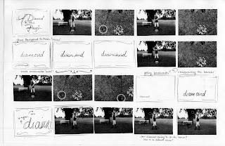
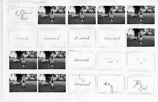
After changing the title to "A Diamond in The Rough" I wanted to go with a "silent film" theme that I beleive goes with the nostalgic feel of my photographs, and it's fun!!! I did a combined animation on this storyboard, and will do the Kinetic type during the "silent film" frames. I also mixed the "type on the image" in with this storyboard when I have diamond reappearing and sitting on the bench.

The font that I am trying to go with is a script font, which I feel relates to the diamond well.


I have the text solely on the image in this storyboard, and I have no "silent film" effect. I don't think it is as interesting, however their are some interesting and funny moments so I will try to incorporate those (diamond on the bench) in my combined storyboard.

This is my final storyboard with time increments. I can't decide if I would like to stick with black and white, or if I would like to go to color since it is still a modern concept with the diamond. I am still going in the "silent film" direction and I plan on making the frames shake and I am currently playing around with some effects to make the film look aged.

Final Storyboard Animations


FINAL STATEMENT
The overall idea of this project was realizing the difference between a narrative and a story by knowing "how" to relay a series of events to a viewer, in which the narrative is the "how" and the story being the actual "series of events".
In my narrative I chose to show the viewer a sequential golf swing from a first person point of view and a third person point of view. My duration of time in this event was limited since essentially a golf swing lasts, maybe 5 seconds in reality. The challenge was making this short moment interesting.
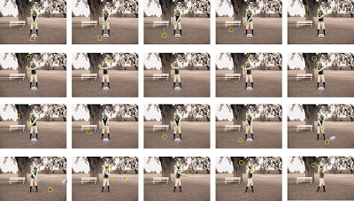
I wanted to comment on the game of golf being a "rich man" sport in a fun and contrasting way by substituting a diamond in for the ball. I chose to take advantage of MISE-EN-SCENE in my narrative by setting up my own photo-shoot. I chose to dress my subject in a prototypical 1950's golf attire and photographed him on a dated golf course. In this scenario I also took advantage of temporal distortion by sending the viewer back in time, which helps to make this brief moment a little more captivating. I also included diagrammatic shapes on top of the subject that reveal a dated display of how to swing the club, which I discovered in book that was written in the last 1950's.
The third person point of view is the most interesting since there is more context in the composition of each photograph. I found that when i combined the two points of view it helped to relate a more interesting narrative structure. By transitioning from third person to first person it emphasizes the rudimentary skill-set of a golf swing, in which they always say "never take your eye off the ball", or in this case "never take your eye off the diamond". It shows the subject staring at the diamond until he makes contact in which I stop the transitions back to first person and focus on him in the third person actually watching the diamond fly away.

Monday, September 7, 2009

Storyboards


This is my first person point of view, it is the golfer looking down on himself hitting the golf ball (the jewel). The Jewel is a commentary on the game of golf being a rich person sport. I find it to be quite entertaining, the jewel is so shiny!

This is my 3rd person point of view of someone watching the golfer swing. The duration of time that my story is taking up is only about 10 seconds of time. I want to take on the challenge of making such a short amount of time interesting. The extra elements of commentary help such as; the jewels, the diagramatic shapes, and the 1950's vintage look. They all speak on their own.

Thursday, September 3, 2009

Vintage Golfin'


These photos are the images for each slide in my narrative. I was playing around with the rendering styles and my goal was to give these images a 1950's vintage fee. I applied a warming filter to get a worn sepia tone. I also blurred the background and kept the foreground in focus since most images from that time period have a completely different depth of field compared to cameras today.